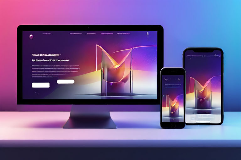
Transform Your Website: Master Responsive Design for Ultimate User Experience
Introduction:
In today’s digital age, having a responsive website is crucial for any business, especially for IT service providers and web development companies. A responsive design ensures your website looks great and functions perfectly on all devices, from desktops to smartphones. In this comprehensive guide, we will explore the key elements of mastering responsive design to elevate your website’s user experience and keep your audience engaged.
What is Responsive Design?
Responsive design is an approach to web design that makes web pages render well on a variety of devices and window or screen sizes. This technique ensures that your website automatically adjusts its layout and content to fit different screen sizes, providing an optimal viewing experience for users.
Why Responsive Design Matters:
- Improved User Experience: A responsive website adapts to the user’s device, offering an easy-to-navigate and visually appealing experience.
- Higher Search Engine Rankings: Search engines, particularly Google, prioritize mobile-friendly websites, boosting your search engine ranking.
- Increased Conversion Rates: A seamless user experience can lead to higher engagement and conversion rates.
- Cost-Efficiency: Maintaining one responsive site is more cost-effective than managing separate desktop and mobile versions.
Key Elements of Responsive Design:
1. Fluid Grids:
Fluid grids use relative units like percentages instead of fixed units like pixels to define the width of page elements. This allows the layout to adjust and resize dynamically based on the screen size.
Example:
.container {
    width: 100%;
    padding: 20px;
}
2. Flexible Images:
Images should resize within the context of their containing element without losing quality. This can be achieved using CSS properties.
Example:
img {
    max-width: 100%;
    height: auto;
}
3. Media Queries:
Media queries enable you to apply different styles depending on the device characteristics such as screen width, height, and orientation.
Example:
@media (max-width: 768px) {
    .sidebar {
        display: none;
    }
}
4. Responsive Typography:
Font sizes should be scalable to ensure readability across all devices. Using relative units like ems or rems for font sizes can help achieve this.
Example:
body {
    font-size: 1rem;
}
Best Practices for Responsive Design:
“Good design is as little design as possible.” – Dieter Rams
- Mobile-First Approach: Start designing your website for the smallest screen size first and gradually enhance the design for larger screens. This ensures a better mobile experience.
- Simplified Navigation: Simplify navigation for mobile users by using hamburger menus, collapsible sections, and easily clickable buttons.
- Test Across Devices: Regularly test your website on various devices and browsers to ensure compatibility and responsiveness. Tools like BrowserStack and Google’s Mobile-Friendly Test can help.
- Optimize Images: Optimize images for faster loading times without compromising quality. Use formats like WebP for better compression.
- Use Responsive Frameworks: Leverage responsive frameworks like Bootstrap or Foundation that provide pre-designed responsive components and grid systems.
Case Study:
Aapki Khabar News Portal: A Success Story
Aapki Khabar , a local news service provider in Jharkhand, revamped their website using responsive design principles. The result? A 30% increase in mobile traffic and a 20% boost in overall engagement. Their new responsive website has attracted more local engagements, enhancing their reputation as a local news portal in Jharkhand.
Conclusion:
Mastering responsive design is essential for any business aiming to thrive in today’s digital landscape. By implementing the principles and best practices outlined in this guide, you can create a website that not only looks great on any device but also drives higher engagement and conversions. Stay ahead of the curve and ensure your website is ready for the future.
Discover more from Just-CO
Subscribe to get the latest posts sent to your email.


