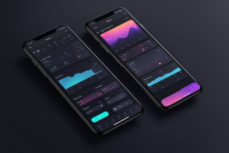
Master Dark Mode Design: Essential Tips & Tricks for Stunning UIs
Master Dark Mode Design: Essential Tips & Tricks for Stunning UIs
In recent years, dark mode has surged in popularity among users and designers alike. This trend, initially popularized by major platforms like iOS and Android, offers a sleek aesthetic while providing numerous functional benefits. Designing for dark mode requires a nuanced approach to ensure readability, contrast, and overall user experience. In this article, we’ll delve into essential tips and tricks to help you master dark mode design.
Why Dark Mode?
Dark mode isn’t just a fleeting trend; it’s rooted in practical benefits. Users prefer dark mode for its reduced eye strain, especially in low-light environments. Additionally, dark mode can extend battery life on OLED screens, making it a favored choice for mobile users.
Key Benefits:
- Reduced Eye Strain: Easier on the eyes in low-light conditions.
- Battery Efficiency: Extends battery life on OLED devices.
- Aesthetic Appeal: Offers a modern, sleek look.
Understanding Color Theory in Dark Mode
When designing for dark mode, it’s crucial to revisit color theory. Unlike light mode, dark mode uses a predominantly dark color palette, which necessitates a focus on contrast and readability.
Contrast and Readability
High contrast is key to making text and elements stand out against a dark background. Use light text colors like white, off-white, or light gray to ensure legibility. Avoid pure black backgrounds; instead, opt for dark shades of gray to prevent high-contrast issues that strain the eyes.
Accessible Color Palettes
Ensure your color choices meet accessibility standards. Tools like WebAIM’s contrast checker can help you select colors that provide sufficient contrast ratios, making your designs inclusive and readable for all users.
Understanding cross-platform development can help in implementing consistent dark mode design across various platforms.
Crafting a Balanced User Interface
Dark mode design should be more than just inverting colors. Thoughtfully crafted UI elements can enhance the overall user experience.
Highlighting Elements
Use color sparingly to highlight important elements. Bright, vibrant colors work well for calls to action or key highlights, ensuring they stand out against a dark backdrop without overwhelming the user.
Typography in Dark Mode
Opt for bold, readable fonts. Thin fonts may lose legibility against dark backgrounds. Consider using larger font sizes and increased line spacing to enhance readability.
UI Components
Design UI components like buttons, toggles, and cards with subtle shadows and highlights to give them a sense of depth and dimension.
For a deeper dive into UI principles, explore our guide on the basics of UI/UX design.
Optimizing Images and Media
Images and media content need special attention in dark mode to maintain visual coherence and quality.
Adjusting Image Brightness
Bright images can create an unpleasant contrast in dark mode. Consider adding overlays or adjusting the brightness and contrast of images to blend seamlessly with the dark background.
SVGs and Icons
Use SVGs for icons and ensure they are optimized for both light and dark modes. Choose icons that maintain clarity and visibility without causing eye strain.
Optimizing media is also crucial for website performance, especially for mobile users.
Implementing and Testing Dark Mode
Proper implementation and testing are critical to the success of your dark mode design.
CSS Media Queries
Leverage CSS media queries like prefers-color-scheme to automatically detect and apply dark mode preferences. This approach ensures a seamless experience for users who have set their devices to dark mode.
User Testing
Conduct thorough user testing to gather feedback and make necessary adjustments. Real-world testing helps identify potential issues and areas for improvement.
Just as in dark mode design, user testing is essential for mobile app security.
Enhancing User Experience
Beyond aesthetics, consider the overall user experience when designing for dark mode.
Interactive Elements
Interactive elements should be clearly distinguishable. Use hover effects, animations, and color changes to indicate interactivity and engage users.
Consistent Design Language
Maintain a consistent design language across all platforms and devices. Consistency enhances usability and creates a cohesive experience for users switching between light and dark modes.
Consistent design is crucial, whether integrating chatbots or designing for dark mode.
Conclusion
Designing for dark mode involves more than just inverting colors. By understanding color theory, optimizing UI components, adjusting media, and thoroughly testing, you can create a visually appealing and user-friendly dark mode experience. Keep your users in mind and continue to iterate on your designs for the best results.
Dark mode is here to stay.
Embrace it with these tips and tricks, and watch your designs shine in the dark.
Discover more from Just-CO
Subscribe to get the latest posts sent to your email.


